Total Pageviews
Showing posts with label Digipak. Show all posts
Sunday, 23 December 2012
Wednesday, 21 November 2012
Digipak & Advert Feedback
I had members of my class openly view my digipak and advert and this is the feedback that I received:
Alex wrote: "I like the front cover and advert, but doesn't really stand out just with black and white"
Jack listed: - Good professional photos
- Realistic Reviews
- Modern advertising
- Nice theme
- Cool Font
- Better cutting out needed
- Move font on disc
Laura wrote: "Advert looks current and professional and matches well with Digipak. Some editing of photos on digipak could be improved."
Vish wrote: "The digipak looks like a whole package. Black and white works well and is simplistic."
An Un-Named person: "Good use of font and text layout. Definite grayscale theme. Edges need smoothing on advert models - looks jagged."
Thursday, 8 November 2012
Monday, 5 November 2012
Digipak Idea
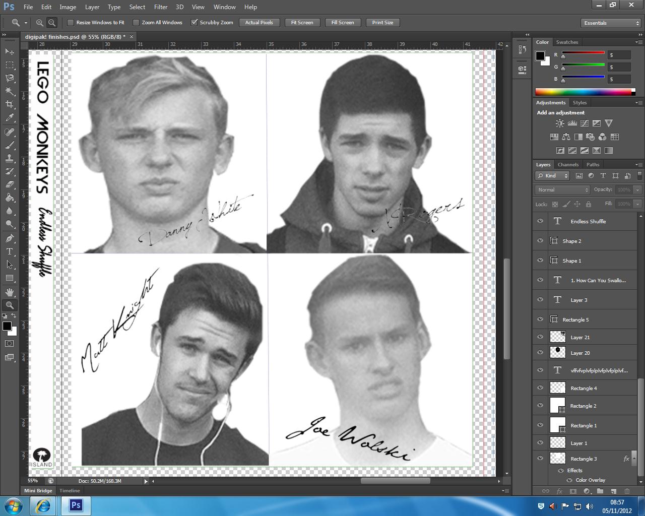
This week is the deadline to finish the digipak and advert so of course I am now thinking more seriously on how to improve my drafts. One of the evaluation points that I was given was how the panel I have cropped below looks more like something a boy band would have rather then something an actual band would have, and frankly I agree but want to change it. My teacher showed me this album cover from a band kind of similar to mine called: 'The Crookes'. This is their 2012 album 'Hold Fast', and even if the band is not exactly like mine I still think I can take a lot of inspiration from it to make mine look more professional.
Monday, 29 October 2012
Digipak & Advert Feedback
The first feedback point was regarding my digipak that I had posted it the wrong way around and that when it came to my final digipak that it needs flipping.
Also, my teacher noted that she believes there is some confusion with the images over the genre of the band. Stating that the image with the 4 way cut of there faces looks more like a pop music album making them more like a boy band and the bottom left image that I used of the singer of Bombay Bicycle Club with the guitar looks like a full on rock album which makes a contrast.
Next, they noted that I should remove the beige colour and simply make the album black and white which to be honest I agree with.
Overall, my teachers awarded it 5/10 making it a high level 2
In regards to my advert, my teachers said they liked the idea behind the images of the band and that it had good potential.
However, they did criticise the sizes used for the texts bellow the mage and said that I need to reconsider and look at making them more to scale and try incorporate the rule of thirds more.
Overall, my teachers awarded my advert 5/10 which also makes it a high level 2
Also, my teacher noted that she believes there is some confusion with the images over the genre of the band. Stating that the image with the 4 way cut of there faces looks more like a pop music album making them more like a boy band and the bottom left image that I used of the singer of Bombay Bicycle Club with the guitar looks like a full on rock album which makes a contrast.
Next, they noted that I should remove the beige colour and simply make the album black and white which to be honest I agree with.
Overall, my teachers awarded it 5/10 making it a high level 2
In regards to my advert, my teachers said they liked the idea behind the images of the band and that it had good potential.
However, they did criticise the sizes used for the texts bellow the mage and said that I need to reconsider and look at making them more to scale and try incorporate the rule of thirds more.
Overall, my teachers awarded my advert 5/10 which also makes it a high level 2
Friday, 19 October 2012
Monday, 15 October 2012
Possible Colour Palettes for Digipak/Advert
Colour palette 1 was my first idea probably because out of my 3 designs it is the simplest design and the 3 colours match the best which could be considered to be a good thing from making a clear idea by using well known matching colours, but could be a bad idea because this could make my digipak plain and not have anything interesting about it. Overall, I still think colour palette one could be used successfully.
Colour palette 2 was a bit of a random choice spurring from my idea that I could involve like a beige colour qaswell as black and white. I like this idea because I think it would be quite unique since these colouurs would not obviously go together.
I decided on the colours for colour palette 3 because I wanted to have at least one abstract idea with the colours so choosing a bold red and blue would have this effect. I think this idea could work but out of the 3 colour palettes I think this would need the clearest concept. Also, if i was to use this colour scheme I would consider swirching the red for pink but I am unsure whether this would fit in with the genre of my band.
Wednesday, 10 October 2012
Album Cover Text
To help inspire me with my own album cover to go on my digipak I have been looking at the headers of different albums of the same genre as my band.
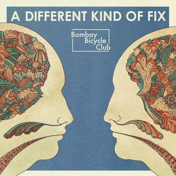
I particuarly like the header with the words 'A Different Kind Of Fix'. I think the simplistic nature of the text fits well with the theme of the album. Also I like how the text is not massive but because the album is fairly plain it is clear that it is the header. Although I like the text saying 'Bombay Bicycle Club' I think it is a unique band logo which it like the bands stamp.
Another bands album covers that I looked at is Two Door Cinema Club and on these two album covers I think there are some clear links in the use of one central image using a close up which I think works well. Also, the use of central text over the image is a convention they have carried throughout the album, but I like how they haven't exactly stuck too the same font each time but position it the same.
With this text from the band: All Time Low being repeated in different forms I think it creates a strong brand identity to which I hope I can create a similar representation. On the text itself I like how it looks like they have taken a plain text and made it personalised to the band through roughing the edges of te text and adding small features like te skull and crossbones in the text.
On this Fall Out Boy cover I like how the text with the album name & band name are not prominant on the cover but they are still clear to see which think works really well.
Monday, 1 October 2012
Digipak Inspiration
Now that I am starting to look for designs for my own digipak I started by looking in this book: 'Reasons To Be Cheerful: The Life and Work Of Barney Bubbles'. It is a book full of designs from radical English graphic artist, Barney Bubbles. I chose to look in this book because even though Barney died in 1983 it is widely consider that his designs can be transferred to fit modern designs
Wednesday, 26 September 2012
Album Tracklist
1. How Can You Swallow So Much Sleep
2. Bad Timing
3. Your Eyes
4. Lights Out, Words Gone
5. Take The Right One
6. Shuffle
7. Beggars
8. Leave It
9. Fracture
10. What You Want
11. Favourite Day
12. Still
Since the song I am using, 'Shuffle', is from the Bombay Bicycle Club Album: 'A Different Kind Of Fix' I decided to use the tracklisting from that album to make it seem more realistic since they are real songs.
Subscribe to:
Posts (Atom)