To help inspire me with my own album cover to go on my digipak I have been looking at the headers of different albums of the same genre as my band.
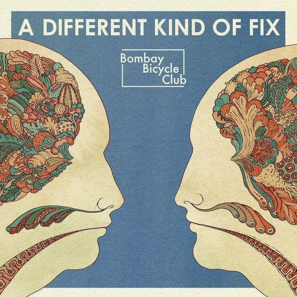
I particuarly like the header with the words 'A Different Kind Of Fix'. I think the simplistic nature of the text fits well with the theme of the album. Also I like how the text is not massive but because the album is fairly plain it is clear that it is the header. Although I like the text saying 'Bombay Bicycle Club' I think it is a unique band logo which it like the bands stamp.


Another bands album covers that I looked at is Two Door Cinema Club and on these two album covers I think there are some clear links in the use of one central image using a close up which I think works well. Also, the use of central text over the image is a convention they have carried throughout the album, but I like how they haven't exactly stuck too the same font each time but position it the same.


With this text from the band: All Time Low being repeated in different forms I think it creates a strong brand identity to which I hope I can create a similar representation. On the text itself I like how it looks like they have taken a plain text and made it personalised to the band through roughing the edges of te text and adding small features like te skull and crossbones in the text.

On this Fall Out Boy cover I like how the text with the album name & band name are not prominant on the cover but they are still clear to see which think works really well.
No comments:
Post a Comment