The first feedback point was regarding my digipak that I had posted it the wrong way around and that when it came to my final digipak that it needs flipping.
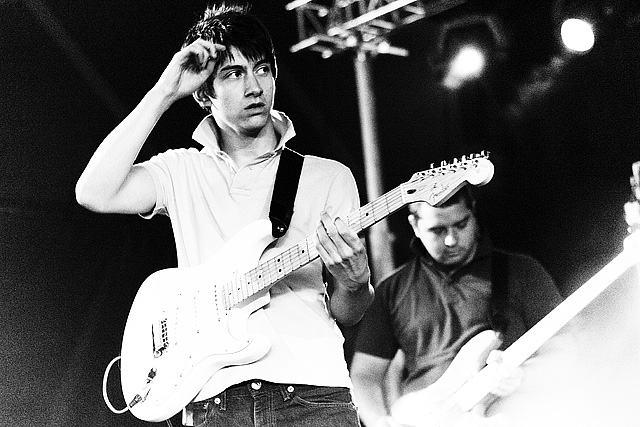
Also, my teacher noted that she believes there is some confusion with the images over the genre of the band. Stating that the image with the 4 way cut of there faces looks more like a pop music album making them more like a boy band and the bottom left image that I used of the singer of Bombay Bicycle Club with the guitar looks like a full on rock album which makes a contrast.
Next, they noted that I should remove the beige colour and simply make the album black and white which to be honest I agree with.
Overall, my teachers awarded it 5/10 making it a high level 2
In regards to my advert, my teachers said they liked the idea behind the images of the band and that it had good potential.
However, they did criticise the sizes used for the texts bellow the mage and said that I need to reconsider and look at making them more to scale and try incorporate the rule of thirds more.
Overall, my teachers awarded my advert 5/10 which also makes it a high level 2
Monday 29 October 2012
Technical Problems
I wanted to start editing my video today but there is the major problem that some how when i was filming my video have saved onto the hard drive of the camera rather then the memory card of which I intended it to be on. This means I will have to leave editing for now and bring in a cable for the camera tomorrow.
Arctic Monkeys


As part of my verbal feedback to my digipak and poster it was suggested that I should look at images of the band: Arctic Monkeys. Instantly my favourite feature in all the image is how unstaged they are, this element makes them appear more authentic and more off a band from how they don't exactly pose for pictures

Sunday 28 October 2012
Progress over half term
Unfortunatly, 3 of the 4 members of my band have been on holiday during the half term break so not much filming has taken place. This means I am on tight shedule this week to finish my filming but with all the lads hopefully at college everyday it should be manageable
Friday 19 October 2012


Thursday 18 October 2012
Updating Twitter
I have been updating the band page with post regarded to what's been happening with the band regarding my work. On the page I have tweeted posts and pictures from the band an I retweeted one of my personal tweets with a picture of the band

Monday 15 October 2012
Possible Colour Palettes for Digipak/Advert

Colour palette 1 was my first idea probably because out of my 3 designs it is the simplest design and the 3 colours match the best which could be considered to be a good thing from making a clear idea by using well known matching colours, but could be a bad idea because this could make my digipak plain and not have anything interesting about it. Overall, I still think colour palette one could be used successfully.
Colour palette 2 was a bit of a random choice spurring from my idea that I could involve like a beige colour qaswell as black and white. I like this idea because I think it would be quite unique since these colouurs would not obviously go together.
I decided on the colours for colour palette 3 because I wanted to have at least one abstract idea with the colours so choosing a bold red and blue would have this effect. I think this idea could work but out of the 3 colour palettes I think this would need the clearest concept. Also, if i was to use this colour scheme I would consider swirching the red for pink but I am unsure whether this would fit in with the genre of my band.
Thursday 11 October 2012
Borrowed Tools
This is some of the kit I have borrowed for the filming of my music video:

This is a Sony DCR-SR58 Camcorder. Luckily, it belongs to a friend so I won't have deadlines on borrowing one from college and I can film shots whenever I want. Since I don't know much about technical things I found this list of features on the internet:
60x Zoom Vario-Tessar Lens
Steady ShotThis helps to minimise wobble and blurring caused by camera movement. This is good because currently I don't have a tripod.
Face DetectionThe HDR-SR58 will detect faces in your image frame and ensure that they are in focus, well exposed and have natural skin tone.
800k Sensor and VGA moviesThe high resolution 800k pixel CCD sensor ensures sharp video as well as good quality VGA still images.
2.7" Power-on LCDThe DCR-SR58 is equipped with a wide 2.7" touchscreen display that also has the clever function of turning the camera on when opened if desired.
Keyboard

I am fourtune that I have been able to borrow a keyboard from a friend with a musical background. This is important because if you listen to the song (shuffle) you can hear that a piano or keyboard is crucial
Bass Guitar

My brother is in his own band so I have been able to borrow his bass guitar. I do not have all the kit I will need but as far as im aware I will eb able to borrow kit such as drums, microphones and another guitar at stayfree when we are recording
CD Covers
 I like how on this cover it is a freeze frame of one of the members opening a bottle of champagne which shows the liquid firing out which normally would happen to fast to be noticed. Also, I like how they have used the effect to make the pictured band grey so they match the title and album name text.
 On this album cover of Busted, my favourite part and the most predominate factor is the image. I like how the main image is taken from quite a high angle so as a group they are looking up at it. Also, I like how the band are looking straight down the camera and the member at the back is pointing. i think this works from how it engages the viewer with the cover.
 When looking at this album cover the first bit that I notice that I like is how they use brown as their background colour which usually a band would not do but they make it work. Also, I like how the image makes it look like the band are exploding out of the centre of the cover which is added too by the squiggles around the sides. Finally, I like how the images of the band members look as if they have been cut out of a magazine and stuck on the cover which makes it look like a piece of rough work which I think makes it work unconventionally in a good way.nb
 I like this Razorlight album because of the simplicity of it. I think it still expresses the band without needing more then the header and simple pictures of each band member. If I was to use something like this for my album, I wouldn't have my band dressed so smartly even though by that I just mean that I think that two of the members are wearing blazers which I would consider to be too smart for my band.
Wednesday 10 October 2012
Album Cover Text
To help inspire me with my own album cover to go on my digipak I have been looking at the headers of different albums of the same genre as my band.
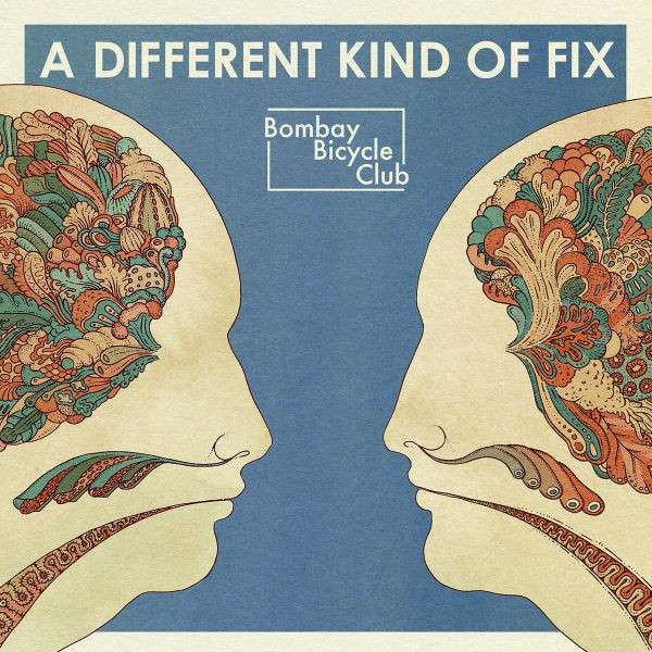
I particuarly like the header with the words 'A Different Kind Of Fix'. I think the simplistic nature of the text fits well with the theme of the album. Also I like how the text is not massive but because the album is fairly plain it is clear that it is the header. Although I like the text saying 'Bombay Bicycle Club' I think it is a unique band logo which it like the bands stamp.


Another bands album covers that I looked at is Two Door Cinema Club and on these two album covers I think there are some clear links in the use of one central image using a close up which I think works well. Also, the use of central text over the image is a convention they have carried throughout the album, but I like how they haven't exactly stuck too the same font each time but position it the same.


With this text from the band: All Time Low being repeated in different forms I think it creates a strong brand identity to which I hope I can create a similar representation. On the text itself I like how it looks like they have taken a plain text and made it personalised to the band through roughing the edges of te text and adding small features like te skull and crossbones in the text.

On this Fall Out Boy cover I like how the text with the album name & band name are not prominant on the cover but they are still clear to see which think works really well.
Tuesday 2 October 2012
Animoto Pitch Feedback
After presenting my animoto pitch to one of my teachers this is someone of the feedback that she had that we discussed:
Firstly, in my pitch I included the idea that I wanted some shots of live performance from my band which is an ok idea. But when asked about it I had little idea of where I would film it or what instruments I would borrow. So I think I need to make sure I have a clearer idea of the aspects involved in live performance.
Secondly, when discussing my concept of filming it throughout the day I elaborated on the idea of the music video appearing that the events of it are happening throughout a day. This would work throughout a day by filming at differrent times of natural brightness to create the effect of different times.
Also, my teacher expressed a concern that even though my ideas could work that maybe I dont yet have enough content for my video. Although I have considered it, I have figured I will address this when I draw my storyboard so that I have a better idea of how much content I actually have
Monday 1 October 2012
The Real Life Band
Although I am attempting to create the persona of the band, I think it is also important to explain who exactly I will be using in my video and why I have chosen them:

 On the left here is Danny White. As part of my band he will be lead singer and a bassist. I knew immediatly when I came up with the concept that I wanted to use him since I think he will be able to bring a fun element to the video and also be able to take the filming seriously to help me produce the best possible end product.
On the right here is Matt Knight. As part of my band he will be the guitarist as well as taking up a large role in the other scenes. I wanted Matt to be included in my production since he is one of my closest friends and I knew that I would be able to trust him to be fully commited to filming. Also, I think his general style of clothing fit well for a band and the particular song. Also we live in the same village which comes in connvinently for filming.

 On the left here in the shirt and tie is Joe Wolski. As part of my band he will be on drums. I wanted Joe to take on this role since he has past experience on the drums so he will be able to pull of proffesional looking shots. Also, he is very good friends with the other band members which makes me believe their on camera chemistry will shine through well.
Finally, On the right is Matt Rogers. Although I have only known him for a short time I knew that he would fit since he has experience in drama which he is studying at A-Level. Also I think his humor and relax attitude will come through well, (which is why I went out of my way to convince him)

 On the left here is Danny White. As part of my band he will be lead singer and a bassist. I knew immediatly when I came up with the concept that I wanted to use him since I think he will be able to bring a fun element to the video and also be able to take the filming seriously to help me produce the best possible end product.
 On the left here in the shirt and tie is Joe Wolski. As part of my band he will be on drums. I wanted Joe to take on this role since he has past experience on the drums so he will be able to pull of proffesional looking shots. Also, he is very good friends with the other band members which makes me believe their on camera chemistry will shine through well.
Finally, On the right is Matt Rogers. Although I have only known him for a short time I knew that he would fit since he has experience in drama which he is studying at A-Level. Also I think his humor and relax attitude will come through well, (which is why I went out of my way to convince him)
This is a drama video that matt took part in a short film that won best comedy short at Screen Stockport Film Festival 2011
Also, it is highly convient for me having these lads to use since we all go to the same college making it much easier to plan ahead as a group which means good communication amongst them :).
Digipak Inspiration

Now that I am starting to look for designs for my own digipak I started by looking in this book: 'Reasons To Be Cheerful: The Life and Work Of Barney Bubbles'. It is a book full of designs from radical English graphic artist, Barney Bubbles. I chose to look in this book because even though Barney died in 1983 it is widely consider that his designs can be transferred to fit modern designs
Subscribe to:
Posts (Atom)